With AI (Artificial Intelligence) so prominent these days, it’s easy to feel like the sky…
Why I Save All My Line Art as 1200 DPI Bitmap Tiff Files
Last post, I discussed why I save virtually all of my work as native PSD documents as opposed to other file types. However, there was one exception I noted: black and white line art. Here’s why, instead, I always save black and white line art as 1200 DPI bitmap TIFFs:
Printing quality
In line art, 1200 DPI bitmap TIFFs print a lot sharper than 300 DPI greyscale PSDs. That’s because bitmaps only use two colors—white and black—as opposed to the hundred shades of grey a greyscale image may use. To see the difference, the following images have been zoomed in greatly. Notice how the Bitmap TIFF is sharp and clear, while the greyscale PSD is a bit fuzzy around the edges?
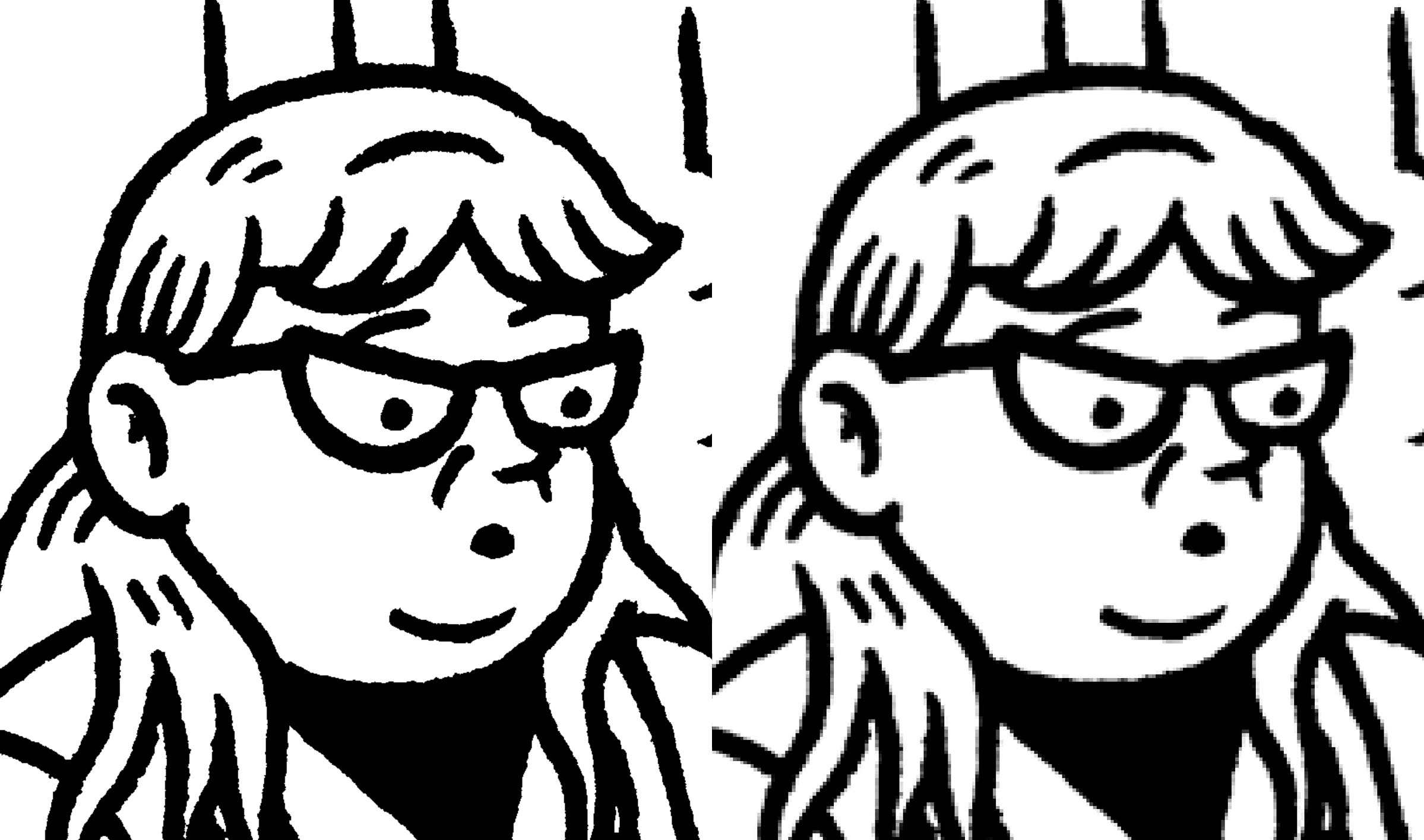
Part of the reason is the large difference in DPI and part is because the TIFF only uses black and white pixels so the edges are hard and jagged as opposed to the greyscale PSD, which rounds out those edges by filling in lighter shades of grey. While this may seem like a simple monitor test, it’s not. You can actually see the different results in real commercial printing if you compare the two. The 300 DPI greyscale PSDs will feel softer and muddier while the 1200 DPI bitmap TIFFs will feel nice and crisp. So, for the sharpest black and white line art (that isn’t vector), 1200 DPI bitmap TIFFs are the way to go.
Flexibility
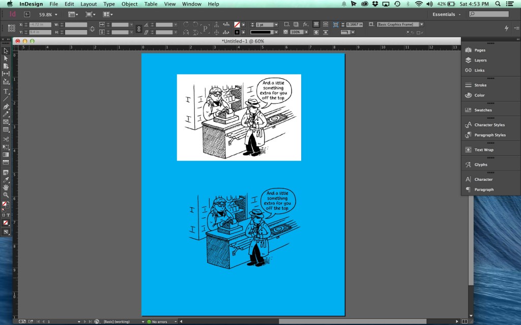
Line art files saved as bitmap TIFFs are also a little more flexible and easier to work with in InDesign than line art saved as greyscale PSDs. For one, they import with the white pixels as transparent, as you can see below.
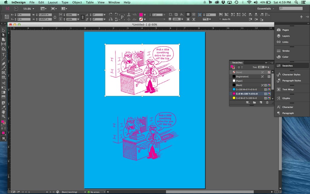
Another thing that makes them a pleasure to work with is you can change their color in InDesign without having to go back to Photoshop. All you have to do is select your bitmap TIFF with the white selection arrow and you can change it to any color you want. You can do the same with a greyscale PSD, but then you still have that pesky white background to deal with unless the line art is on its own layer in Photoshop with the white knocked out to transparent.
And, if you’re working on large project, the small amount of time you save can really add up.
Final Thoughts
So, those are just the general reasons I scan and work with all my line art as 1200 DPI bitmap TIFFs. There are, of course, other good reasons (people who use the non-photo blue pencil technique, for instance), but in general it’s about sharpness, printing quality, and flexibility.
Thanks Neil, this was a really useful post. Cheers.
Nice post!
A revelation to me. I’ve been scanning at 500DPI JPGs. Will do this from now on.